While Android devices were always been light years ahead of iOS on customizability, affordability and even reliability in some cases, it has always lagged behind due to three key factors: Privacy, UI (User Interface) inconsistency, and OEM defragmentation. Google LLC, the company behind Android has finally started fixing atleast the first two of them with the latest builds of Android : Android 12 and the upcoming Android 13. Let’s discuss them one by one and analyze how Android is catching up with iOS.
Privacy
Don’t get me wrong, Android does respect your privacy and has a beautiful application permission manager in the system. But it always had huge number of loopholes and when compared to iOS and Google is improving it actively since 2015, the release of Android Marshmallow, the sixth major iteration of Android versions.
In iOS you are totally in control of what applications do with your phone and its data. For example, iOS 14 released in 2020 had this green and orange indicators on the status bar that basically indicated if an app is using your camera or microphone.
Even for someone like me who is an “Android Fanboy”, this was revolutionary and changed the way applications deal with your camera and microphone. They no longer can access the microphone or camera on your back.
Another ground-breaking privacy feature that iOS brought almost an year before Android was the option to give ‘Approximate location to applications’. This meant that whenever an application requested location access, you have the choice whether to grant pin-point accurate location access or an approximate location. The motive has obvious: while a navigation application like Apple Maps or a food delivery app requires accurate location to you, a social media app doesn’t: So why give them the ability to track you?
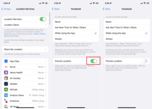
The list is endless but let’s focus on the privacy features that Android has brought up since Android 12 (2021) probably inspired from iOS.
Privacy Dashboard
If you’re running Google’s version of Android, navigating to Settings>Privacy>Privacy Dashboard gives you an analysis of what all permissions are used by each application and the number of times they did that.
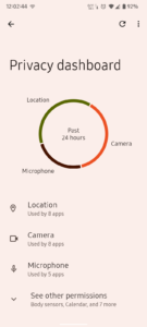
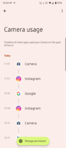
This is quite impressive and helps you keep an eye on activities of applications and thus take necessary actions.
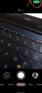
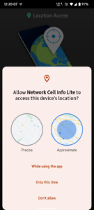
Sensor Access Indicators and Approximate Location: Yes Google took this idea straight off from iOS it seems, and that’s for good. You now have indicators on the status bar as well as quick panel whenever an app accesses your camera, microphone or location. Also just like in iOS, you the Approximate Location Access option too from Android 12.


Sensor Switches on Quick Panel
Something that mimics hardware kill switches, but using software. Buried in the developer options of Android 11, Android 12 has it out for the public (finally).
You now have software switches for your camera and microphone too. Turning it off implies no application can use that hardware, even if it has the permission. This something that is actually handy in situations where you are e.g. in a confidential atmosphere and you don’t trust you phone enough.
Even though I personally doesn’t believe it is as secure as actual hardware switches (neither iPhones have that), let’s hope it is since neither did I get any evidence to back it. If you don’t see these options on your Android 12 smartphone, you have to manually add it to the quick panel using the pencil icon below the panel.
There are more such seemingly small but useful privacy features Google brought with Android 12 like improved notification settings but let’s move on to the next section now.
User Interface Inconsistency
This is something iOS doesn’t have at all while Android had since ages and made the user experience dull. In iOS e.g. every app looks and behaves consistently, be it a system app or a third-party app, the drop down menus, toggles and every single element in almost every application has the same design language. On the contrary, not even the system apps had a consistent look in Android, every single app had a different design language. In simple terms, the Chrome in Android and the settings app in Android doesn’t look as if they belonged to the same OS platform, while in iOS, it does. UI inconsistency is more evident while comparing across smartphones manufacured by different manufacturers, e.g., the Google Pixel linup runs an Android that has a User Interface similar to the AOSP (Android Open Source Project) while Samsung devices run on OneUI, which doesn’t resemble mainline Android in the UI/UX department. We’ll talk more on that in the ‘OEM Defragmentation’ section of this article
Material You: Google’s kickstart initiative to fix that

Last year, Google came up with ‘Material You’, a ‘Unified Design Language’ that entirely changed the way Android looked. It has the ‘Monet Theme Engine’, that using the color shades from you wallpaper, generates a consistent design palette that shapes the UI colors atleast across all system applications and widgets. Material You further makes the icons, buttons and UI elements bigger and (debatably) quite appealing to eyes. This was a huge leap and as of 2022, some popular third-party apps have also partially started complying with this UI language.
Here is how my the UI of my phone running a near AOSP Android 12 ROM with Material You looks
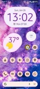
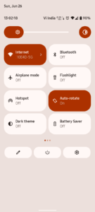

‘Material You’, for real needs time to be matured enough before it is fully adopted by the majority of app developers out there but Google has already taken the first step of making a fluid design language across Android. Everyone may not appreciate the huge buttons and color theme changes with Android 12 but it’ll eventually become ‘normal’ and we would finally achieve a consistent User Interface across applications in Android.
OEM Defragmentation
This is something that is a double-sided coin for Android. There are more than 10 popular android OEMs (Original Equipment Manufacturers) with around 1,300 brands which has produced nearly 24,000 distinct Android devices as of 2015. For example, Samsung, which is just ‘one of the Android OEMs’ itself has released more than 15 models in 2021 itself and if we start counting every manufacturer, we’ve had more than 300 distinct Android phone releases in 2021 while Apple has launched just 4 models, all under the Iphone 13 series.
‘Is Defragmentation affecting Android negatively?’
Let us look into the brighter side first. Defragmentation provides the user with choices. Android phones are available at every price limit a person can practically imagine and thus every feature stack. There are photography oriented phones, productivity oriented phones, gaming oriented phones and the list is endless. On the contrary, iOS believes in the ‘It does the job’ philosophy wherein a single iPhone does everything in a decent manner. There may not be an iPhone with a 108 Megapixels sensor but the 12 MP sensor on the iPhone 13 does the job neatly.
So how does defragmentation have a negative impact? More choices implies inconsistency in everything you can imagine. For comparison, the Android 12 on a Google Pixel and the Android 12 based One UI 4 on a Samsung flagship doesn’t resemble each other, which makes you stick to the same brand as your next device too since you’ve built muscle memory on it and thus making the ‘privilege of choices’ pointless.
From the looks to the software, it has become really hard to choose an Android phone that does the job for you perfectly but choosing an iPhone takes seconds if you can afford one. It does everything without making huge compromises.
This is something that Google apparently can’t fix easily and would always remain something that makes Android quite unique: in both ways.
Conclusion
So summing up, what else do you think is that makes Android fall behind and how could it be fixed? Let me know in the comments.
